Infographics and Analytics
Analytics seem to be in use for every area of life these days. Chances are your business is making use of data analysis everyday, but how do you communicate to your customers what matters about the data?
Maybe we’re biased, but we’ve observed that images, especially infographics that relate to your company’s business, is a great way to explain “what it all means” once you have the data. Visual information makes it easier for your viewers to grasp the analysis of your data in a way that is meaningful to them.
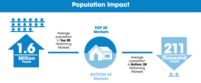
We recently had the chance to develop an infographic for Veros — a real estate analytics firm. The big story was that the top markets were all west of the Mississippi and the bottom markets seemed to be east. The client wanted quite a bit of data about specific markets, so our challenge was to organize that in a manner that still allowed a viewer to get the big picture at a glance.
Tips for creating infographics:
- Pie charts are best to compare percentages to the whole, and for categories that are less than 5% of the total, it may be best to group as “Other”.
- Line charts can effectively show fluctuations over time
- Yes, you can combine more than one type of chart in an infographic; the rule is to keep thing visually simple so the most important facts can be understood in a glance.
Here’s the infographic:


